Give to Medicine Redesign + UX process
Roles and responsibilities.
Spearheaded first ever UX process in-house, securing training for design team. Presented UX process to leadership to implement process internally. Managed creative team and collaborated with writers. Successfully built and tested over 15 prototypes on InVision, including desktop, mobile and tablet versions. Developed visual language to better define organization and mission.
Other creatives working on project:
Carla Bellido, Kate Dohner, Elizabeth Edwards, Bethany Hubbard, Terri Tye
-
Define users and create personas
Develop user-flows that enable users to learn more about fundraising areas and giving
Inspire users to learn about the importance of philanthropy
Create a mobile-friendly, responsive site with better organized content/site-architecture
-
The current Give To Medicine website is not mobile friendly or responsive. Users are unclear where entity sits within the University of Chicago structure and is often confused with the UChicago Medicine website– not the fundraising portion. The website is also difficult to navigate: lacks clear user flow, site description, priority landing pages (eg., cancer, community health, education) , above all hierarchy/clear purpose.
-
The new site must communicate the organization and mission more effectively for users. A better site architecture will improve overall user experience. Site must better reflect University branding while still standing out. It must include landing pages for fundraising priority areas and be mobile-responsive.
-
Adding a content feed that aggregates content and is better organized based on user preferences
Enhanced site structure
Adding spot illustrations to tell complex stories (feedback was icons looked clickable but without too much copy)
Communicating visual brand effectively, users now understand who the organization is and the mission
Developed tablet and mobile prototype to ensure functionality for users based on preference
Our UX process: Better understand users + build for them
-

Research
Completed competitor analysis of 9 academic medical centers, fundraising units, and other non-profits. Reviewed current site analytics and conducted interviews. Flagged the need to better describe mission and area within UChicago Medicine.
-

Analyize + Strategize
Defined site objectives, developed 6 personas, and 4 user-flows based on organizational mission and current user behavior/challenges using the site. Analytics showed tablet + mobile preference; content and verbiage not effective.
-

Hypothesize + Build Prototypes
Organized content and built site architecture through card sorting exercise. Sketched out low resolution prototypes and tested user-flows internally. Made changes based off feedback and built our first prototype on Sketch.
-

Iterate + Test
Conducted 20+ interviews: recorded users navigating site based on user flows: asked questions to understand any challenges. To improve functionality, we made over 15 prototypes (many iterations in-between), testing desktop, mobile and tablet versions.
-

Implement Feedback
After perfecting flow and structure, the bulk of feedback was articulating our work and impact in a succinct yet compelling way. Our writers worked tirelessly on effective copy, and design developed spot illustrations to tell better stories.
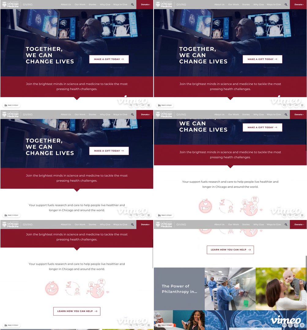
Creating a site based on user feedback and interviews
The homepage was vital. We had to create a high-level yet compelling overview of the site, mission, and who we are.
Copy throughout the site was minimized and tone was set based on user testing: compelling and short.
Other elements will be interactive so users can engage with the site, like the campus map/drawing on the “About Us” page.
Sharing numbers around impact and stories of impact sprinkled in key areas throughout the site was another takeaway from users
Telling better stories through illustration.
Spot illustrations greatly impacted user experience as they conveyed warmth and meaning simply (illustrations will animate on site)
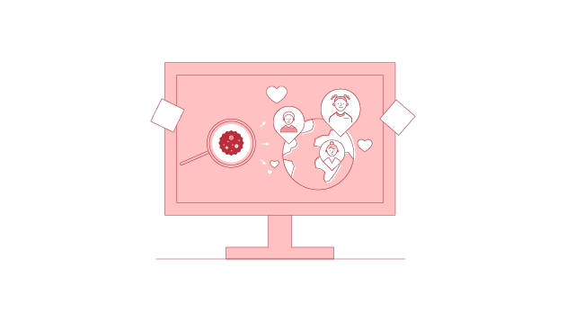
Working within existing UChicago brand standards, our team found creative solutions to evoke different tones throughout the site . We differentiated with color to help users distinguish pages as they explore, keeping the design fresh but cohesive visually.

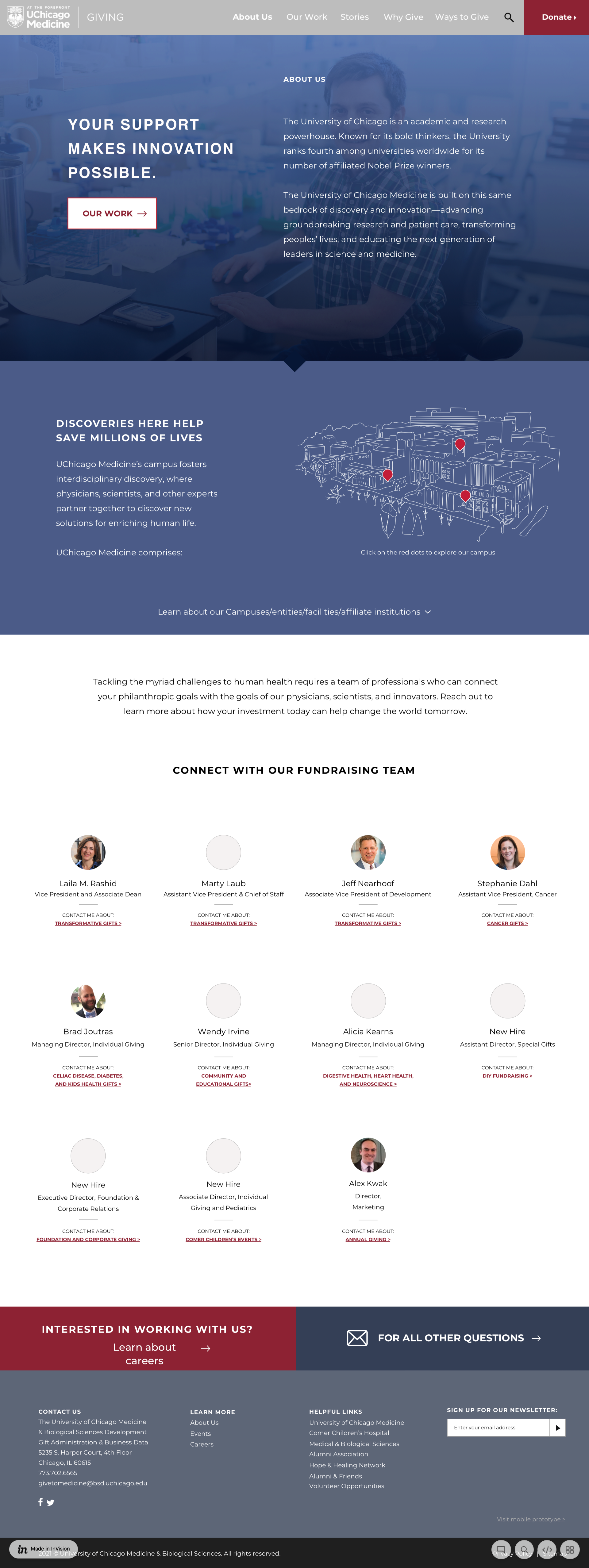
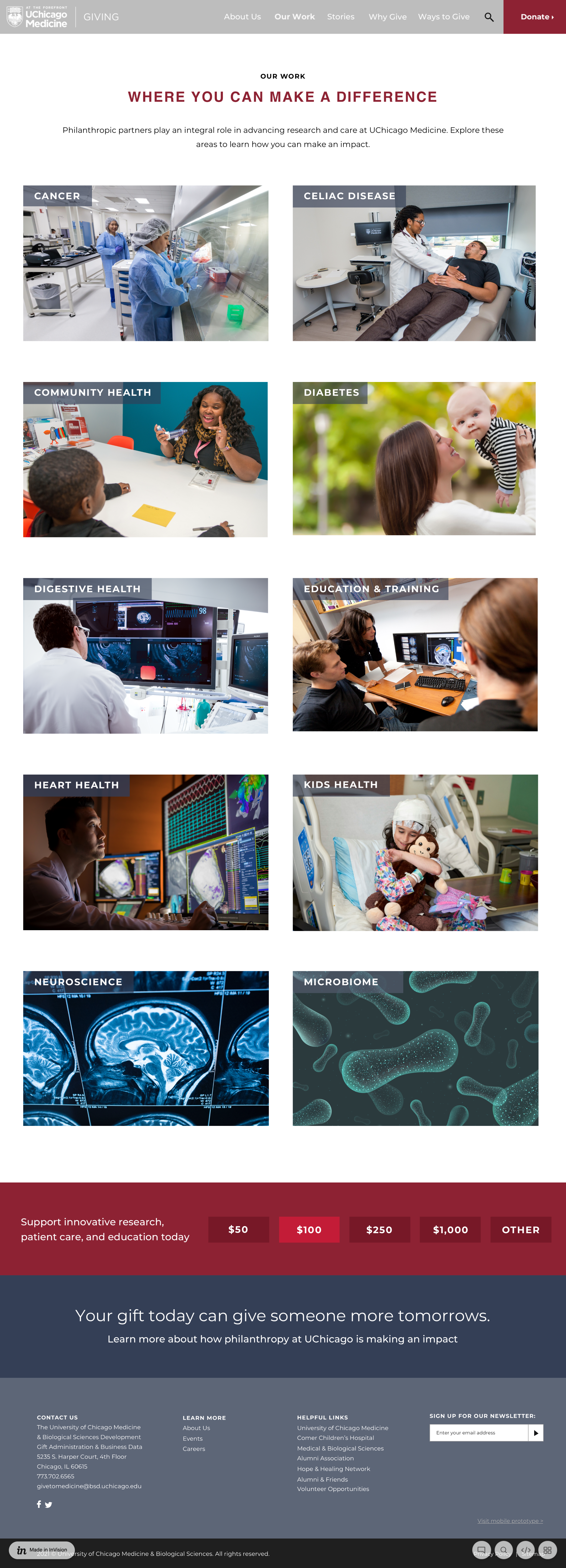

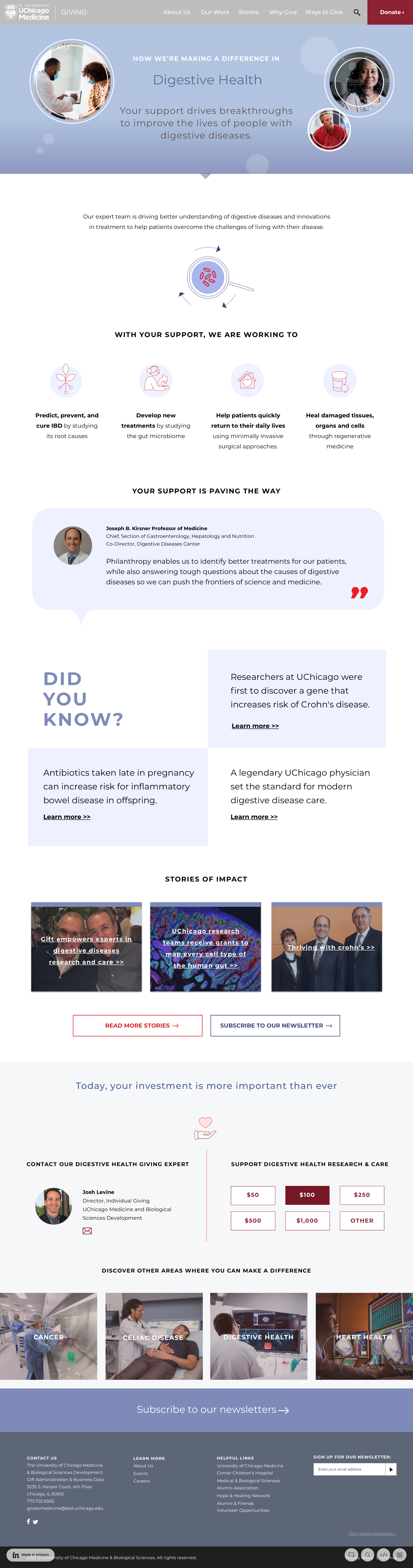
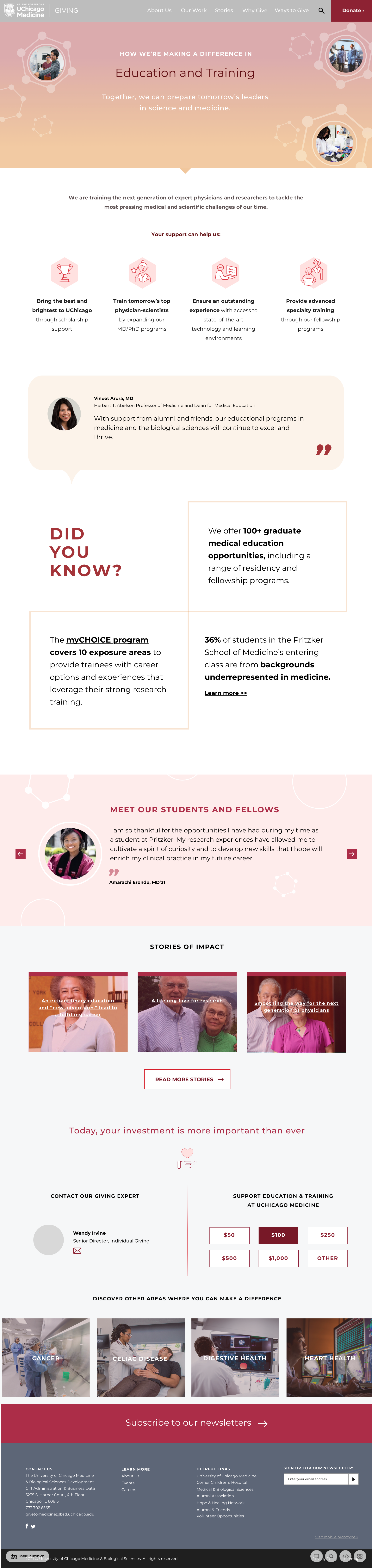

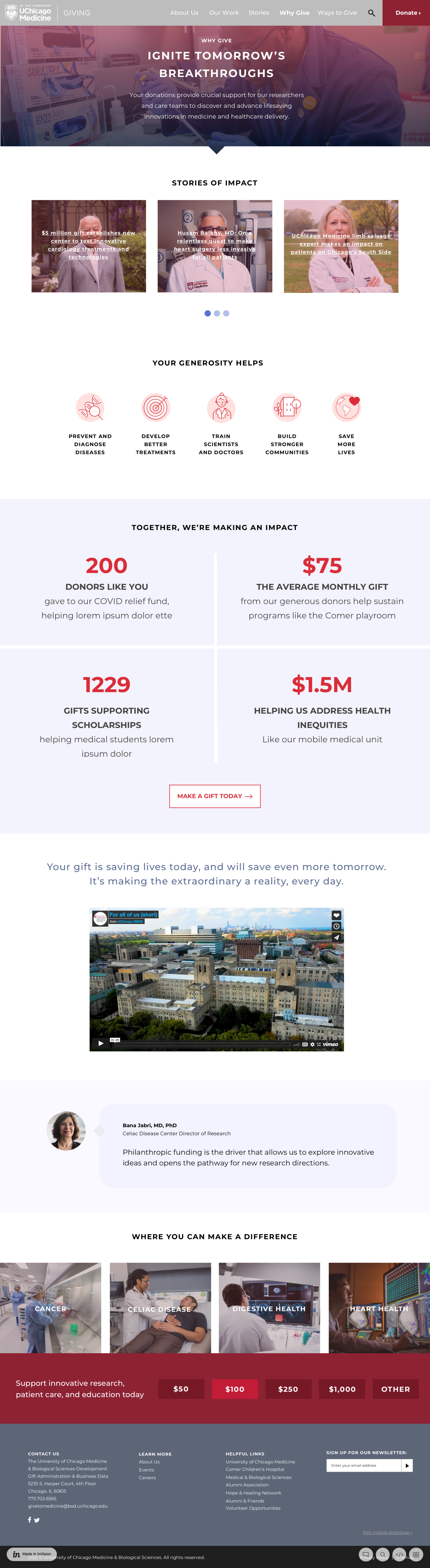
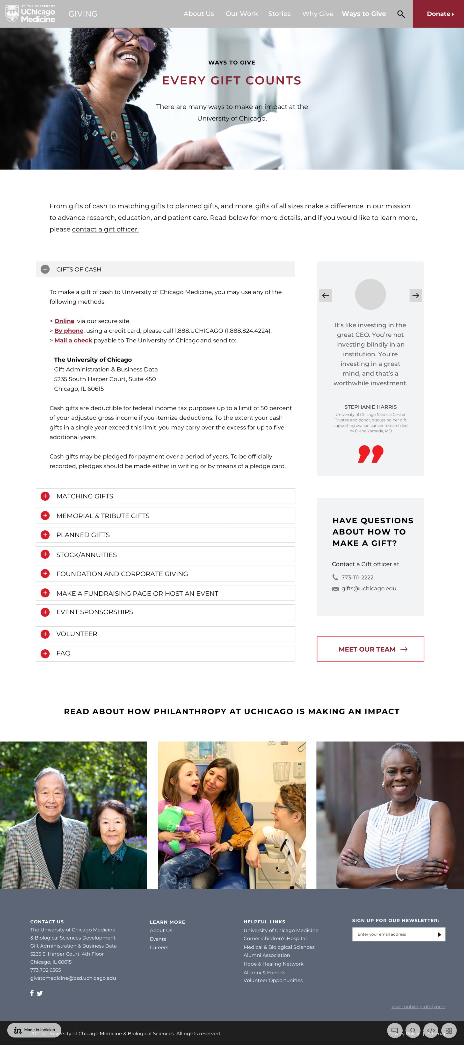
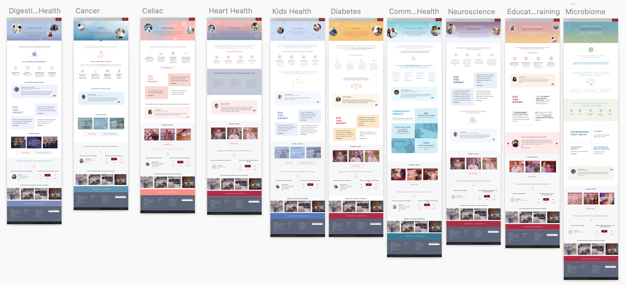
An overview of priority pages in Sketch, the program used to build out the prototype.
Our goal was to both inspire and teach users about the advancements in science and medicine at UChicago and how philanthropy drives this important work.
Next Steps:
Finalize mobile and tablet prototypes to user experience is positive on all devices and begin development. UX practices will be ongoing by reviewing analytics, making improvements, and conducting a/b testing.